 |
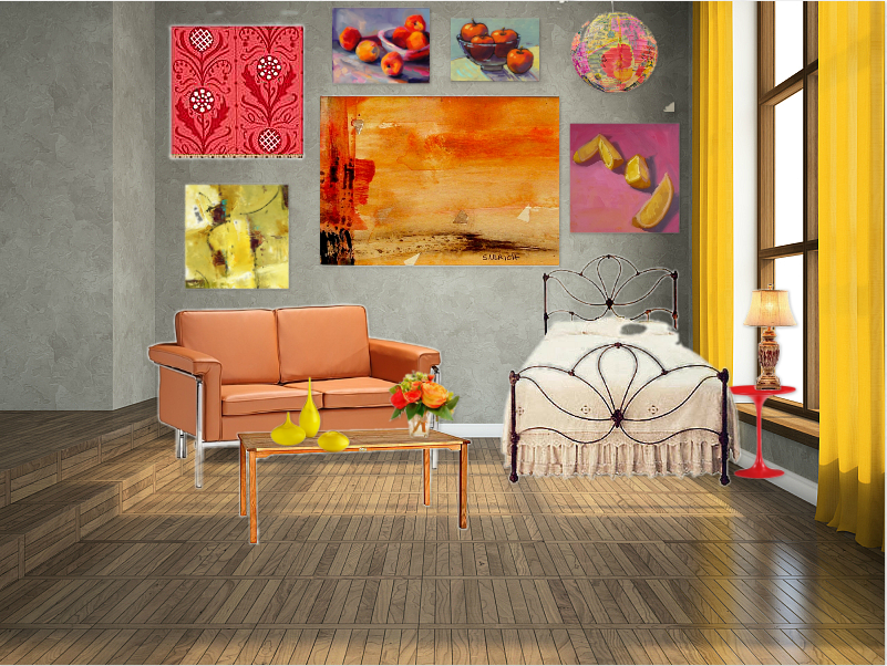
| In this room I incorporated the 3 types of rhythm. Repetition in the pillows, radiation in the main picture of the rose, and lastly gradation in the vases on the table going from big to little. |
Friday, December 13, 2013
Principles of design-Rhythm
Wednesday, December 11, 2013
Pricaples of Design-Harmony
 |
| Obviously my theme is flowers and floral print. The two elements that are present are color, there is a complementary color scheme using red and green My other element is line there is lines on the clock and lines boarder the picture on the wall. Unity was created by have floral things tie in to the same room. This makes all parts of the room is related to one idea. Variety was created by having my 2 element of design play a role in this room. |
Tuesday, December 10, 2013
Principles of Design-Proportion and scale
 |
| This room is in scale and very proportional. The flowers fit the table, the chair now goes with the couch and the pillow fits in the the rest of the room. With all of these changes the room is now proportional. |
 |
| This room is my room that is not in scale/proportion. The lamps are too small, the flowers are too big, and the chair is too big also. Going along with that the pillow is too small for that chair. In conclusion those are the reasons that this room is unproportional and not in scale. |
Thursday, December 5, 2013
Principles of Design-Emphasis
 |
| My emphasis is my Christmas tree. I feel this is the emphasis is on the tree because it is well decorated and is takes up with most space. For the other objects in the room I tried to make them colors that go with the tree, but wouldn't stand out next to it. |
Wednesday, December 4, 2013
Design challenge-Balance
Although both rooms are different they both have balance. Here are the rooms i came up with.
 |
| Here is a room that is a asymmetrical, although still has visual balance. |
 |
| This room is symmetrical and obviously has visual balance. |
Thursday, November 21, 2013
Design Challenge
 |
| My olioboard has all the elements of design. There is space between the chairs and couches that you can tell that the table is in front of the couch or chairs. The next element of design is line. There are examples of line in the picture to the left of the couch. Also the creases in the couch give off line. Next is form. Everything (besides the pictures) in this room has form because it is all 3D. some things with nice form are the lamp, kids table/toy and the tables. Last but not least we have texture. Some textures that stand out to me are the front of the reception desk, the fabric of the couch and the smooth wooden floors. |
Friday, November 15, 2013
Element of Design:Texture
 |
| I made this room so it is full of texture. I have some Visual texture on the blue fuzzy picture, the couch, chairs. and the plant. There is audible texture on the leather ottomans, wood table, and both velvet pillows. The last texture i have is tactile texture which is found it the big wooden table, the purple fuzzy pillow, the clock with a smooth texture and lastly the floor also with a smooth texture. |
Thursday, November 14, 2013
Line Design Examples
 |
| This room has many examples of curvy lines. Most of the curvy line are decorative, the lines on the wallpaper, Flowers, and decor on the tables. There area also functional curvy lines on the lighting fixture and on the chairs in the corners. Over all the curvy line give this room a more natural and relaxed feel. |
 |
| In this room there are many diagonal line. The line on the carpet and on the lamps all have diagonal lines. Diagonal lines will have the appearance of movement to make a vibrant fun room. |
 |
| This room has some good examples of horizontal lines. The rug, stairs, and shelves are all horizontal lines. Horizontal lines make the room feel wider. |
 |
| This room has a lot of vertical lines that will make the room feel taller. it will also bring your eyes up toward the ceiling . |
Thursday, November 7, 2013
Lines
These are some wallpapers that i came up with in spoon flower. I made one with diagonal or chevron lines that make us think of movement. The other on has vertical which draw your eyes upward and make things seem taller.


Wednesday, October 9, 2013
Color Schemes
Monochromatic


This would be an example of a monochromatic color scheme. it is made up of one color. I chose blue because you can make a lot of different hues of blue. The effect that any monochromatic color scheme is a calming effect on the space. I thought sense blue was calming color that is would fit the monochromatic color scheme well. I think it turned out really good and would make a like relaxing living area.


For my analogous color scheme the colors red, yellow, and orange. I know this is a analogous color scheme because the definition in "a group of similar colors". The effect that a analogous color scheme is it is vibrant and interesting. I pick the colors red, orange, and yellow because they are some of my favorite colors and i feel that they look good next to each other.


This would be an example of a split complementary color scheme. It has red, purple, and yellow-green. I like this color scheme and the colors together make a less intense and energized room. I picked these colors because i knew there is a lot of yellow-green decor.


I made a room that is a triad color scheme. You know that it is because the colors that make it up are blue, yellow, and red. Those colors are equally spaced from each other on the color wheel, which makes it a triad color scheme. The effect it has on a room is It makes a room more vibrant. I thought by putting the primary colors together it is more simple, but by adding patterns it makes it more interesting.
Friday, September 27, 2013
Housing Styles
 |
| this is a cape cod because it has a large central chimney, gabled dormers,and shingled facade. |
 |
| this is a colonial house because its symmetrical, and it has side lights. |
 |
| this is a ranch/split level house because it has gable decorations, and the windows are level with the ground. |
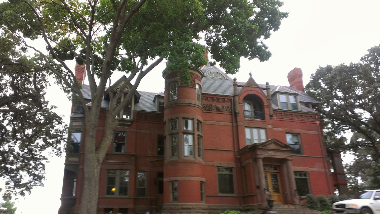 |
| this is a Queen Anne because it Has many gables and turrets, large porch and decorative shingles. |
 |
| This is a Greek Revival style because it has pillars, and a formal portico |
 |
| This is tudor house because it has a steep roof, wooden trim, and there's stone by the front door |
 |
| This is a bungalow house because of the low roof, and natural colors |
 |
| this is a prairie style because it has wide over hangs and hipped roof. |
 |
| this is a dutch style because a gambrel roof and that's a big sign of a colonial revival-dutch. |
 |
| this is a neo-eclectic house because is has palladian windows and a front gable roof. |
Thursday, September 26, 2013
Housing Styles Accessories
roofing styles
 |
| HIPPED ROOF: A roof with slopes on all 4 sides. |
 |
| GABLE ROOF: a triangular section of a wall fromed by the end of a pointed roof. |
 |
| GAMBREL ROOF: a roof with two slopes on each side, the lower slope having a steeper pitch. often found in colonial revival houses and dutch style. |
 |
| SALTBOX ROOF:a building with a long, pitched roof that slopes down to the back, |
 |
| MANSARD ROOF:a roof that has four sloping sides, each of which becomes steeper halfway down. |
Housing Characteristics
 |
| BAYWINDOW: a set of 2 or more windows that protrude out from the wall. |
 |
| CASEMENT WINDOW: a window that opens by swinging inward or outward, like a door |
 |
| CLAPBOARD: also known as siding, long narrow boards overlapped to cover outer walls. |
 |
| DORMER: the setting for a veritcal window in the roof, often found up stairs. |
 |
| EAVES:the portion of the roof the projects beyond the |
 |
| FANLIGHT: a semi-circular or arched window above a door |
 |
| PEDIMENT: a triangular crown used over doors, windows,or porches. |
 |
| RAFTERS: a roof beam sloping from the ridge of the wall |
 |
| SIDELIGHTS: widows and either side of a door |
 |
| TURRET: a small tower often on the corner of a building. common in queen anne style. |
 |
| PORTICO:large porch usually with a pediment roof supported by classical columns |
Subscribe to:
Posts (Atom)